








Article
26. A Website Homepage That Explains the Offer in One Screen

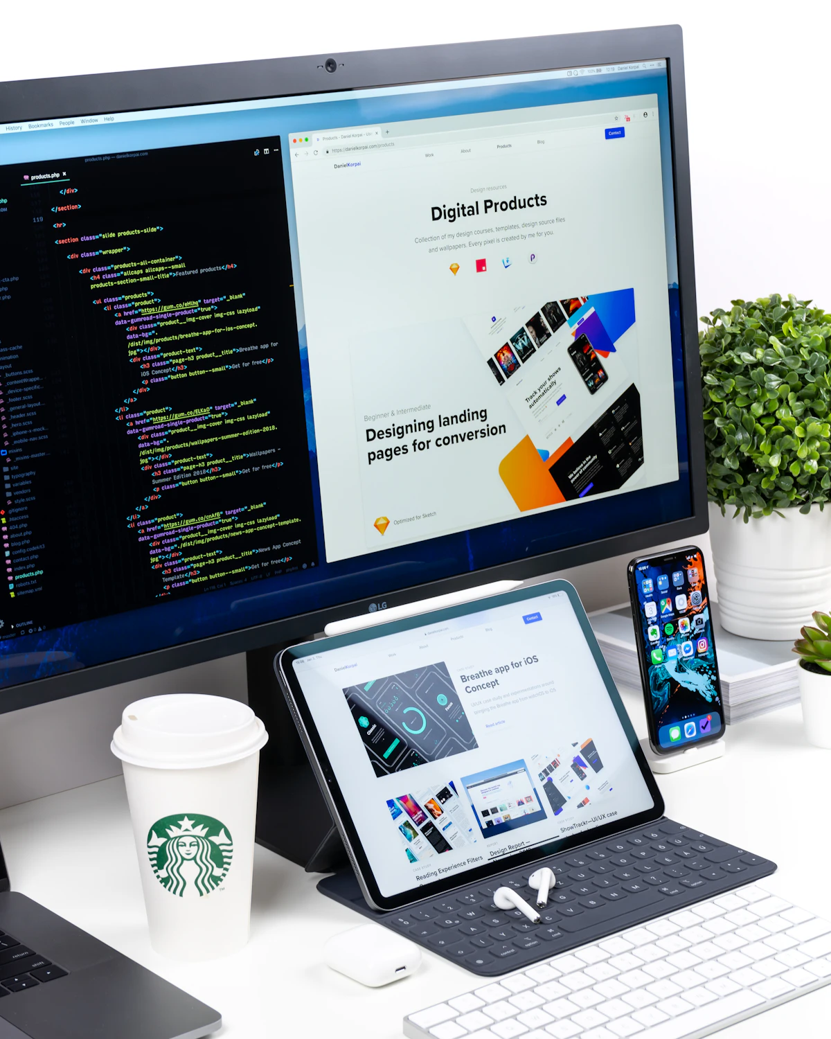
A Malaysian founder often checks the company homepage on a phone, not on a wide monitor in a quiet office. The person might be a buyer in a shop lot in Petaling Jaya, a parent between school runs in Johor Bahru, or a facilities manager scrolling in a lift. The first screen has to do the work of a clear shop sign. It should say who the business helps, what it actually sells, and what the visitor should do next. If that screen is a large photograph with a vague line, the visitor still does not know whether you fit out cafes, service air conditioners, or run a tuition centre.
One screen does not mean one clever slogan. It means the offer is understandable before any scroll on a common phone width. A headline, a short supporting line, a single next step, and a small proof note can live together if you stop treating the top of the page as a poster. Decorative video, rotating banners, and three competing buttons eat the space where the offer should have been. The photograph can stay. It simply cannot be the only thing that speaks.
< >
Write the offer before anyone opens a design file
Use plain language you would say at the counter. We service commercial kitchen hoods for restaurants in the Klang Valley, and we can book a site visit this week. We prepare management accounts for owner-run companies that are tired of a shoebox of receipts. We design shopfront signage and install it in Penang and Kedah. If you cannot say the sentence without hiding behind a brand adjective, the homepage is not ready for layout. Designers can make a true sentence look calm. They cannot rescue a sentence that refuses to name the work.
Name the buyer as well as the service. A bakery supplier might sell to cafe owners, not to anyone who likes bread. A clinic might see families and children, not every possible need under one vague word. Specificity is not a smaller business. It is a faster decision for the right person, and a kinder no for the wrong one. The visitor who is not your buyer should be able to leave quickly instead of calling your staff with a mismatched job.
One next step, then a proof line a person can check
Keep a single primary action. Call, book, request a quote, or send a WhatsApp message, but do not give all four equal weight in the first screen. Secondary paths can exist as quiet text. The button should describe the outcome. Book a site visit is clearer than submit. Ask for a menu tasting is clearer than learn more. If your real sales path is a phone call because jobs are surveyed on site, say that. Pretending every firm must push people into a form creates friction you will then blame on the design.
A practice such as PsyCore, which offers marriage, family, and child therapy in Johor Bahru, shows the value of naming the work and pointing to a way to ask for a time. You do not need to copy a clinic. A packaging printer, a pest-control firm, and a language school can pass the same test. A stranger should repeat the offer after looking once. Proof belongs there only if it can be read in a moment: based in Shah Alam, on-site across Selangor, invoices show SST where it applies. Do not invent ratings or promise a reply you cannot keep on a public holiday.
- Who is this for, in the words a buyer would use?
- What do you sell, without a slogan doing the work?
- Which area do you actually cover?
- What should the visitor do next?
- What will you not take on, if that saves a wasted call?
 >
Test the first screen with someone who is not on staff
Hand them your phone, show only the first view, and ask three questions. What do we sell. Who is it for. What would you tap if you wanted it. If they pause, rewrite the line, not the colour palette. Do this in the language your buyers use. Many Klang Valley firms need an English line plain enough for a busy manager, and a Bahasa Malaysia line that is not a stiff translation of a marketing slogan. If both languages appear, neither should hide the meaning.
If a new staff member cannot greet a walk-in with the same words as the first screen, the homepage and the shop are telling two different stories.
Cut anything that argues with the offer. A newsletter box, a festival popup, and a row of social icons do not explain a service. Seasonal hours for Hari Raya or Chinese New Year can be a short line. They should not replace the product. Look at the screen in sunlight as well as in the studio. A headline that wraps into five lines has stopped being a headline. If the photograph is dark, put the text on a solid panel.
< >
Let the rest of the page support the first screen
After the offer is clear, answer the next questions a serious buyer has. How the work starts. What you need from them. A simple price range if you are willing to publish one. The first screen earns the scroll. The sections below should reward it. If those sections repeat the slogan, you have written a brochure, not a path to a conversation.
Review the top of the page when you add a service. A new workshop or a maintenance plan should not become a second button squeezed into the hero unless it replaces the main offer. Navigation can carry the rest of the company. The top of the page should stay boringly clear, including on the small screen your buyer is already holding.